Why the New Home Page?
Do you know the saying about the shoemaker's children? I do a lot of things on the web but I usually feel I don't have time to work on my web page, so that it reflects my interests and priorities. The page has had the same design for years, and all I have ever done is plug new courses into the same old template. So here were some considerations that went into my redesign:
![]() Knowledge of the Web. While my webpage
hadn't changed, my knowledge of the web has been progressing. I still have
never had the time to become as competent in web page development as I would
like, but I can do more now than just throw my material into a table. So, for
now, using an image map is an amusing way to present my information.
Knowledge of the Web. While my webpage
hadn't changed, my knowledge of the web has been progressing. I still have
never had the time to become as competent in web page development as I would
like, but I can do more now than just throw my material into a table. So, for
now, using an image map is an amusing way to present my information.
![]() Getting Away from All That Text. The old
web page was primarily textual in nature, whereas I am a very visual person.
Getting Away from All That Text. The old
web page was primarily textual in nature, whereas I am a very visual person.
![]() The Teaching Machine. My love of teaching
is one thing that will never change, but there are other aspects of my
professional life that infuse my teaching.
The Teaching Machine. My love of teaching
is one thing that will never change, but there are other aspects of my
professional life that infuse my teaching.
![]() Decentering the Image. The thing I have
always found the most painful about my old web page is the centered symmetrical
nature of it. A contemporary aesthetic has been
very important to me, and this is much more along the lines of wanting my users
to be active and to make choices. So you decide what you want to click
on . . .
Decentering the Image. The thing I have
always found the most painful about my old web page is the centered symmetrical
nature of it. A contemporary aesthetic has been
very important to me, and this is much more along the lines of wanting my users
to be active and to make choices. So you decide what you want to click
on . . .
![]() You Can Still Look in the Middle. For all
that, there is something in the middle. It may not be the most important thing,
but it may be fun!
You Can Still Look in the Middle. For all
that, there is something in the middle. It may not be the most important thing,
but it may be fun!
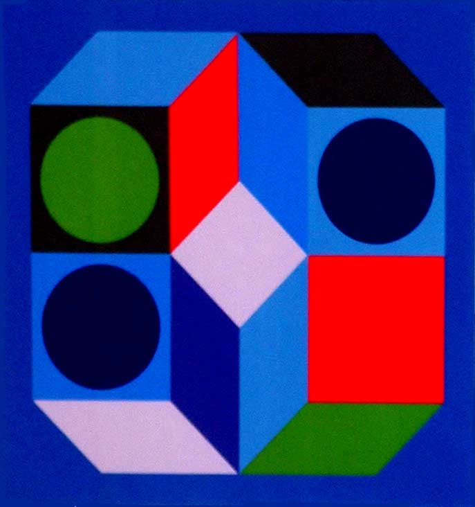
Note: The picture in the
new design is based on a lithograph by Victor Vasarely. I
feel connected to Vasarely for a variety of reasons. In

![]()
